
Hey Dummy.
In 2015 we closed our doors with promises of coming back soon. Well soon is finally here!
Yeah, yeah we know it’s been a few years, but it’s not like we’ve been sitting around doing nothing! We’ve used the time to really evaluate what Ed Debevic’s was and what we want to become. We’ve always done things a bit differently and we promise that attitude isn’t going anywhere.
More than a restaurant.
We’re more than your typical diner and we needed a brand voice that consistently reminded you, your mom, your dog and everyone else that Ed’s is here and ready to entertain! Rebranding gives us a chance to explore Ed Debevic’s as a way of life.
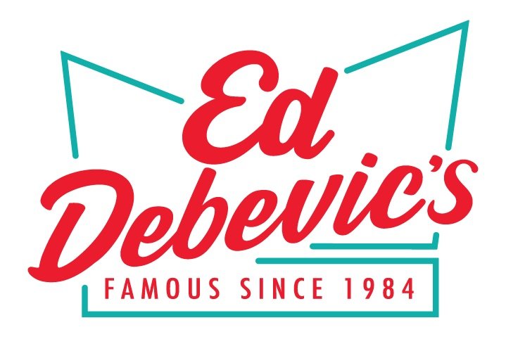
Let’s Talk About the Logo
We knew we wanted a mark that would be easy to recognize, quickly evoke classic diner vibes and be the center of attention.
If you look at that fun shape behind our wordmark, you’ll see the classic diner hat shape. Ed Debevic’s isn’t anything without our customers and we wanted to pay tribute to them and our roots by using our iconic paper hats as the base for our new logo.
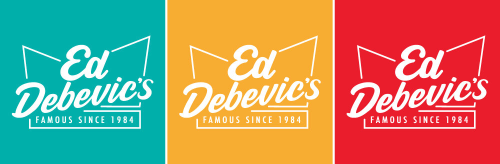

When it comes to color, Keep it simple slick
We’re loud and proud, so when it came time to pick some colors we knew we needed hues that were bold, flashy and vibrant.
Teal - A nod to the building that used to be out in River North
Mustard - The only condiment that goes on our hot dogs
Red - Retro, fiery and yes, the color of ketchup (for fries only!)
We use our core a lot.
Menus, neon, all over our website, where Ed’s goes so will these colors. They do a lot of the heavy lifting, but that doesn’t mean we won’t mix it up from time to time. We’ve got a whole palette of accent colors that’ll help get the Ed’s message across. It’s important to remember that our accents will always be supporting players to help strengthen our primary core.
The Official Ed Debevic’s Pattern
Along with the new logo and color scheme came visual icons. (Have you noticed them yet?) Inspired by our restaurant staples, you’ll see this pattern around! These simple, yet bold icons help us get our brand across without having to use any words. (Sometimes there isn’t time to read, we get it!)

Just like our visuals, our typography has personality
As a brand, Ed’s never really had a strong typographic voice. (Let’s just say we were all over the place) We’ve got a lot to say so we chose typefaces that were strong and easy to communicate with. We don’t have time to squint and peer at text and neither do our customers!
Ed’s is a diner that’s all about keeping the charm from the good ol’ days while bravely pushing forward into the future. Keeping that in mind, it made perfect sense to pair the typefaces Frontage and Futura. Retro, clean, with eyes pointed to the future.

The Same But Different
With our new facelift, we know some of you might be scared the Ed Debevic’s you knew is gone and dead. Don’t worry! You can’t get rid of us that easily! We’ve put a lot of effort into keeping all the things that made us the #1 50’s diner in Chicago while at the same time embracing the world as it’s changed around us.
We hope that you’ll stick with us as we continue to bring that classic Ed’s charm to you and yours. Make sure to say hi to Ed the next time you come by!
